Aggregating points: JSON on SQL and loops on infowindows
by Jorge Sanz on
This blogpost was migrated from the previous content management system that hosted this blog. If you want to check for old comments or to find anything looking weird please follow this link to check the Internet Wayback Machine.
NOTE: I’ll use CARTO but you can apply all this to any webmapping technology backed by a modern database.
Get all the data
So we start with the typical use case where we have a one to many relationship like this:
    select e.cartodb_id,
           e.displayname,
           e.division,
           e.photourl,
           l.cartodb_id as locaction_id,
           l.location,
           l.the_geom_webmercator
      from locations l
inner join employees e
        on e.location = l.location
  order by location
Easy peasy, we have a map with many stacked points. From here you can jump to this excellent post by James Milner about dense point maps. My example is not about having thousands of scattered points that at certain zoom levels overlap. Mine is a small set of locations but many points “stacking” on them. In this case you can do two things: aggregate or not. When you aggregate you pay a prize for readability: reducing all your data to those locations and maybe using visual variables to show counts or averages or any other aggregated value and finally try to use the interactivity of your map to complete the picture.
So at this point we have something like this map, no aggregation yet, but using transparency we can see where CARTO has many employees. We could also use a composite operation instead of transparency to modify the color of the stacked points.
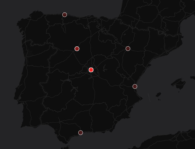 Stacking points using transparency
Aggregate and count
OK, let’s do a GROUP BY the geometry and an aggregation like counting. At least now we know how many people are there but that’s all, we loose the rest of the details.
select l.the_geom_webmercator,
min(e.cartodb_id) as cartodb_id,
count(1) as counts
from locations l
inner join employees e
on e.location = l.location
group by l.the_geom_webmercator 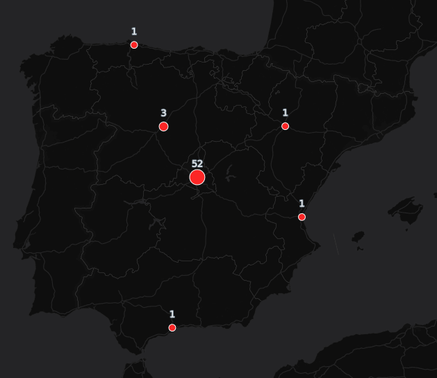 Grouping by location and counting
Aggregate one field
But in my case, with CARTO we have PostgreSQL at hand so we can do way more than that. PostgreSQL has many many cool features, handling JSON types is one of them. Mix that with the fact that almost all template systems for front-end applications allow you to iterate over JavaScript Objects and you have a winner here.
So we can combine the json_agg function with MustacheJS iteration over objects to allow rendering the names of our employees.
    select l.the_geom_webmercator,
           min(e.cartodb_id) as cartodb_id,
           l.location,
           json_agg(e.firstname) as names, -- JSON aggregation
           count(1) as counts
      from locations l
inner join employees e
           on e.location = l.location
  group by l.the_geom_webmercator,l.location
And this bit of HTML and Mustache template to create a list of employees we can add to the infowindow template:
 <ul style="margin:1em;list-style-type: disc;max-height:10em;">
  {{#names}}
    <li class="CDB-infowindow-title">{{.}}</li>
  {{/names}}
</ul>
{{^names}}loading...{{/names}}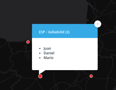
We could do this without JSON types, composing all the markup in the SQL statement but that’s generating quite a lot of content to move to the frontend and of course making the whole thing way harder to maintain.
Aggregate several fields
At this point we can repeat the same function for the rest of the fields but we need to iterate them separatedly. It’d be way better if we could create JSON objects with all the content we want to maintain in a single output field we could iterate on our infowindow. With PostgreSQL we can do this with the row_to_json function and nesting an inner double SELECT to give the properties names. We can use directly row_to_json(row(field1,field2,..)) but then our output fields would have generic names.
select l.the_geom_webmercator,
min(e.cartodb_id) as cartodb_id,
l.location,
count(1) as counts,
json_agg(
row_to_json((
SELECT r FROM (
SELECT photourl as photo,
coalesce(
preferredname,
firstname,
''
) as name
) r
),true)
) as data
from solutions.bamboo_locations l
inner join solutions.bamboo_employees e
on e.location = l.location
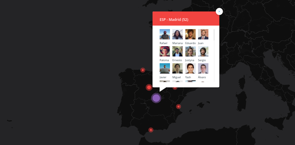
group by l.the_geom_webmercator,l.location order by counts ascWith this query now we have a data field with an array of objects with the display name and web address for the employee picture. Easy now to compose this in a simple infowindow where you can see the faces and names of my colleagues.
<div style="column-count:3;">
  {{#data}}
  <span style="display:inline-block;margin-bottom:5px;">
    <img style="height:35px;" src="{{photo}}"/> <br/>
    <span style="font-size:0.55em;">{{name}}</span>
  </span>
  {{/data}}
</div>
{{^data}} loading... {{/data}}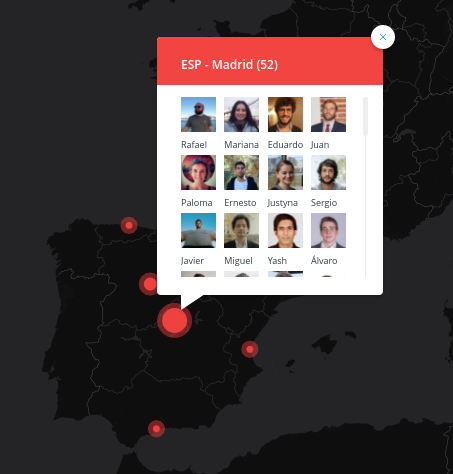
That’s it. You can do even more if you retrieve all the data directly from your database and render on the frontend, for example if you use D3 you probably can do fancy symbolizations and interactions.
One final note is that if you use UTF grids (like in these maps with CARTO) you need to be conservative with the amount of content you put on your interactivity because with medium and big datasets this can make your maps slow and too heavy for the front-end. On those cases you may want to change to an interactivity that works like WMS GetFeatureInfo workflow, where you retrieve the information directly from the backend when the user clicks on the map, instead of retrieving everything when loading your tiles.
Check the map below and how the interactions show the aggregated contents. What do you think of this technique? Any other procedure to display aggregated data that you think is more effective?
Updated: 2022-03-02, Version: 11d47a4.