Mapping for the busy cartographer: today moving dots
by Jorge Sanz on
This blogpost was migrated from the previous content management system that hosted this blog. If you want to check for old comments or to find anything looking weird please follow this link to check the Internet Wayback Machine.
This article describes how to make a quick map using some nice services we have at our hands. Nowadays almost everyone can create a maps using services like CartoDB, Mapbox, uMap or even Google My Maps. In this case I’ll show how I used the incredible flexibility of CartoDB to combine some Postgres/PostGIS SQL with CartoCSS to animate some dots on top of OSM cartography rendered by Mapbox.
This combination is really unique and convenient, other services only allow you to upload or draw some features and decide some static styling for them. But with this combination, using old SQL you can adapt your data for different uses, with CartoCSS the power of the Mapnik rendering library is available and finally, using the awesome Torque capabilities, animation can be added to our map.
About
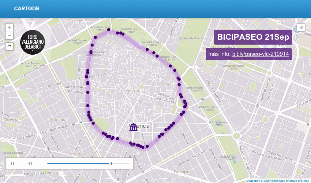
The idea of this map is to represent a crowd of cyclists running along the future bike line by the interior ring of the city of Valencia. Tomorrow Sunday 21 September there will be a march to show the interest of city bikers for this line so my idea was to make people think about how the city look like with this (still imaginary) bike lane full of cyclists, instead of cars.
Data preparation
- Trace a line that represents the route
- Transform the line to EPSG:3857
- Make the line denser, placing points every 25 meters using the «Densify geometries given an interval» QGIS processing tool
- Convert the line to points (again with Processing) and give them these properties:
routeit will serve to produce more routes in the futurelapto separate the points of the route of other points of interest outside the routeidto order the rendering of the points
Visualization
After uploading the dataset to my CartoDB account I’ve created a new visualization that will have these layers:
- A blurred line with the route
- A point marking the meeting place to start the activity, just in front of the city hall.
- The animated points moving over the route
Line
Load the layer paseo and customise the SQL. The SQL is quite self-explanatory, first we filter the points over the line and then we use the ST_MakeLine aggregated function to rebuild our original line.
WITH route AS (
  SELECT *
  FROM paseo
  WHERE route = 1 AND lap>0
  ORDER BY id)
SELECT
  1 cartodb_id,
  ST_MakeLine(the_geom_webmercator) as the_geom_webmercator
FROM route
GROUP BY lap
The styling of this layer is a simple CartoCSS rule with the only trick of a heavy blur filter.
#paseo[cartodb_id=1]{
    line-color: #A53ED5;
    line-width: 8;
    line-opacity: 0.7;
    line-comp-op: lighten;
    image-filters: agg-stack-blur(10,10);
}
Moving dots
This is the most important part of the map, of course. I have a path of points ordered and what I want is to show a more or less crowded ring of people moving. To do it, I’ve created a UNION of ten SELECTs to the table offsetting the id over the full range of id’s. To acieve that I’ve used this long SQL:
WITH route AS (
    SELECT * FROM paseo WHERE lap>0 AND route = 1
),
laps AS (
    SELECT
        cartodb_id, the_geom_webmercator,
        id
    FROM route r1
    UNION SELECT
        cartodb_id, the_geom_webmercator,
        CASE WHEN id  > 25 THEN id - 25 ELSE id - 25 + 254 END id
    FROM route r2
    UNION SELECT
        cartodb_id, the_geom_webmercator,
        CASE WHEN id  > 50 THEN id - 50 ELSE id - 50 + 254 END id
    FROM route r3
    UNION SELECT
        cartodb_id, the_geom_webmercator,
        CASE WHEN id  > 75 THEN id - 75 ELSE id - 75 + 254 END id
    FROM route r4
    UNION SELECT
        cartodb_id, the_geom_webmercator,
        CASE WHEN id  > 100 THEN id - 100 ELSE id - 100 + 254 END id
    FROM route r5
    UNION SELECT
        cartodb_id, the_geom_webmercator,
        CASE WHEN id  > 125 THEN id - 125 ELSE id - 125 + 254 END id
    FROM route r6
    UNION SELECT
        cartodb_id, the_geom_webmercator,
        CASE WHEN id  > 150 THEN id - 150 ELSE id - 150 + 254 END id
    FROM route r7
    UNION SELECT
        cartodb_id, the_geom_webmercator,
        CASE WHEN id  > 175 THEN id - 175 ELSE id - 175 + 254 END id
    FROM route r8
    UNION SELECT
        cartodb_id, the_geom_webmercator,
        CASE WHEN id  > 200 THEN id - 200 ELSE id - 200 + 254 END id
    FROM route r9
    UNION SELECT
        cartodb_id, the_geom_webmercator,
        CASE WHEN id  > 225 THEN id - 225 ELSE id - 225 + 254 END id
    FROM route r10
)
SELECT
    cartodb_id, the_geom_webmercator,
    ((random()*10-10) + id) id
FROM laps;
The first with subquery filters the points of the path for this route that feed the next subquery: 10 unions with an id offset separation of 25 points. This subquery is passed to the main query that finally randomizes the id by +-5 positions, that is the order, so the moving dots are not regular, giving a more interesting (anarchic?) effect.
Using the wizard, the main aspects of the Torque animation are set up. It’s important to use a proper resolution, duration and frame count to adjust the rendering to a nice motion. Afterwards some last touches to the CSS to adjust the compositing operation and specially the trails, leaving just one more rendering of a similar point, instead of the default bigger and more transparent feature.
Map {
-torque-frame-count:64;
-torque-animation-duration:30;
-torque-time-attribute:"id";
-torque-aggregation-function:"count(cartodb_id)";
-torque-resolution:4;
-torque-data-aggregation:linear;
}

#paseo{
  comp-op: minus;
  marker-fill-opacity: 1;
  marker-line-color: #FFFFFF;
  marker-line-width: 0.5;
  marker-line-opacity: 1;
  marker-type: ellipse;
  marker-width: 6;
  marker-fill: #41006D;
}
#paseo[frame-offset=2] {
 marker-width:6;
}
Meeting point
To add a feature to the map to render the meeting point, I manually added a new feature to the layer using the CartoDB editor. This feature will have the property lap=0 so it won’t be on the other layers. The SQL for this layer is just a
SELECT *
  FROM paseo
 WHERE route = 1 and lap = 0
And the CartoCSS is quite simple with the only important trick to use an external SVG. I’ve used directly the town-hall marker from the Mapbox Maki repository.
#paseo{
  marker-fill-opacity: 0.9;
  marker-line-color: #FFF;
  marker-line-width: 1.5;
  marker-line-opacity: 1;
  marker-placement: point;
  marker-type: ellipse;
  marker-width: 40;
  marker-fill: #3B007F;
  marker-allow-overlap: true;

  marker-file: url(https://raw.githubusercontent.com/mapbox/maki/mb-pages/src/town-hall-24.svg);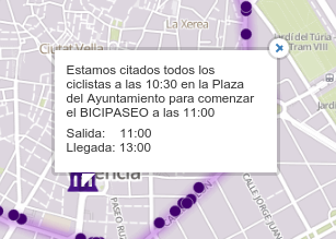
On this layer I’ve also configured an infowindow so when you click on the town hall icon you get some data about the schedule for the event.
Base map
I started using the Nokia day grey base map offered by CartoDB, but after a couple of iterations on the design, I thought it could be great to use a pale purple base map so I went to Mapbox web and quickly crafted a variation of their Mapbox Streets base layer.
Other components
Finally, using the new nice CartoDB layout capabilities I’ve added a simple title for the mobile version of the rendering and a couple of texts and an image (uploaded to imgur) for the logo of the group promoting this activity.
Conclusion
Well that’s all. You can check the visualization here. The job took like 4 to 5 hours. I finished the first animated version in 2/3 hours but you know, devil is in details and designing is always about iterations and refinement. Anyway I’m quite satisfied on the result and I think it serves for its purpose. Definitely I’ll have the opportunity to review and refine this process, as I imagine more routes and bike marches will happen in Valencia where bikers are winning the battle :-)
What do you think about this visualization. What do you like and what do you hate? Improvements? I’d love to hear your thoughts and comments to make better maps.
Update: almost same effect without crazy UNION
This morning Pedro-Juan asked my, why so many UNIONs? why not using just one long CASE?. After accepting the challenge I did something with CASEs but then realized that I wast just looping over a smaller set of id values, so I could use the modulo function. So the long UNION SQL could be reduced to this easy and simple SQL:
SELECT cartodb_id,
       the_geom_webmercator,
       ((random()*10-10) + id%3) id
   FROM paseo
  WHERE lap>0
    AND route = 1;
Wow, that’s so concise compared with the huge SQL above!! Using this id%3 I forced all the values to be just 1,2,3 but with the afterwards random the moving effect is achieved.
The CartoCSS would need also some changes to allow to “fill” the rendering over all the animation time. Check the differences with the above code, specially the number of offsets added:
Map {
-torque-frame-count:50;
-torque-animation-duration:8;
-torque-time-attribute:"id";
-torque-aggregation-function:"count(cartodb_id)";
-torque-resolution:2;
-torque-data-aggregation:linear;
}

#paseo{
  comp-op: minus;
  marker-fill-opacity: 1;
  marker-line-color: #FFFFFF;
  marker-line-width: 0.5;
  marker-line-opacity: 1;
  marker-type: ellipse;
  marker-width: 6;
  marker-fill: #41006D;
}
#paseo[frame-offset=4] {}
#paseo[frame-offset=8] {}
#paseo[frame-offset=12] {}
#paseo[frame-offset=14] {}
#paseo[frame-offset=16] {}
#paseo[frame-offset=18] {}
#paseo[frame-offset=20] {}
#paseo[frame-offset=22] {}
The resultant visualization can be accessed here. Which one do you like more? Do you think it’s worth the simplicity over the (in my opinion) slightly worse effect?
Updated: 2022-03-02, Version: 11d47a4.